Wednesday, October 31, 2007

Drawing Book Sketches


These are my three pencil shape sketches.The triangle was drawn with horizontal lines, the cube with cross hatching and the sphere with random. I was a little confused with the pyramid or cone structure, but I really enjoyed the sphere. I think it looks the best as well.

These were my pen sketches. The pyramid was again horizontal, the cube cross hatching and the sphere was stifling.I really enjoyed the sphere again, but it was very time consuming and really tore up my pen in the act.

This was the staircase structure. It was drawn with the horizontal technique in pencil. I was a little confused where to shade, and wasn't overly happy with the final result, but I thought it was good practice.

This was my last sketch, the staircase structure with cross hatching in pen.

Tuesday, October 23, 2007

My Shading Sketches


This is my sketch of a suitcase, I decided to use the random shading effect for this piece, I am not very happy with it's turn out, but I can hope for the better next time.

This is my sketch of the camera tri-pod. I used the cross hatch effect to add shading to this piece. I was happy with it's turn out but not with the proportions, they were a bit off.

Monday, October 8, 2007

met-a-mor-pho-sis

Choose two 3 dimensional projects to work with: one from the person above you and one from directly below you listed on the Interior Architecture Blog.folio link list. Experiment to see what occurs as these projects evolve into one another.

These are 12 thumbnail sketches I created. I tried to morph both Stephanie and Troy's projects together to create something completely new. In this process I feel a lot of my drawings are fairly similar, but serve good purposes.

This is an outline of my metamorphosis.

These are all three of my projects I produced.


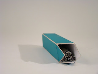
This is the project that has more of Stephanie's idea. It was based off of her Memory Box that held the celebration of Bastille Day in a pop-up box. I added the stripe to represent Troy's pencil box's simplicity. I also made shelves inside to make a tighter space to hold objects, similiar to Troy's pencil box design.


This is the "middle" project. I started off with several ideas and molded it into one combined outcome. The project is a different color because this is before I knew we could only use one project from each person. I chose the teal color to represent Stephanie's egg in her leaf covered egg project, I also used Troy's memory box's first iteration with the grid design at the bottom. I also took Stephanie's memory box with the tabs that open up, similar to the fireworks popping out when you open the box. I took Troy's pencil box into consideration with the tight fit of pencils and the vertical shaped project.


This was my more Troy based project. I decided to base it off of his pencil case. It was almost the exact thing, I took the simplicity of his coloring and opening construction. I tried to incorporate Stephanie's project with the knob on the front and again the compartments inside.

Self Portrait Project


The Objective of this project was to make 8 self portraits of yourself. Along with the portraits you should make some type of stand, display to house your portraits in. The housing can not take up more than 18 by 18 inches. The idea that came to me was to emphasize different features that I like about myself in drawings. I drew one picture of a runner, showing my love to run and be active. It also demonstrates my will power and commitment to my team and juggling college life. Another drawing that I have that was placed on top of my display was my version of my best friend, Lyndsey and I hugging on graduation day. This is one of my favorite pictures of all time. That day was very memorable and it shows how I appreciate everyone that I love in my life and that is one of my top priorities as well. Another drawing I added was an outline of my hair. I thought this was a good drawing to add because many people tell me that my hair is different, it is lighter in the front and darker behind. I also think I am one of the few blondes in class and this would be a good way to know who created this sculpture. My smile is another characteristic that most people compliment me on, I love smiling and I think it makes people feel at ease. I also decided to weave the wire in the teeth to show I have had braces before, this shows everyone is not perfect and there are things that we do not know about each other. I did a more abstract piece in all blue because that is the mood I was feeling when I drew this piece and it comforted me to promote a different style of drawing. I made a sketch of me in my favorite pink hat. I liked this one because the only color I added was in the hat and eyes. I think this makes the piece a little fun and different. Along with the pink hate piece I did another piece outlining only few colors of my features. April told me it reminded her of one of those Barbie cross sketch boards, I thought that was an interesting take. Since it was my first drawing, I wanted to do something fun and simple to show the outward look of me. The last drawing on my piece is a marker sketch of my eye. This was one of my most fun pieces to draw. It was hard trying to blend colors with markers and I thought of it as an adventure. I added my eye because not only is it unique how they change colors, but it also represents my eye for art and different pieces of architecture. The sculpture of the piece was made to resemble an "artistic tree." I wanted something that was growing vertically from the floor and had "branches" off of it. It shows that this is who I am, but with growth and experience there is more still to come.

Memory Box

"Design a Container, to house a memory."

This is my first idea, it was to make a container that changes shape and molds into a different object. The fortune teller seemed like a good idea, but needed a little help.

This was my second iteration, I had a hard time making a project that transformed into another without overlapping or making it sloppy looking.

This was my third iteration that looks somewhat unfinished due to the pictures my mom sent in the mail had not gotten here yet. I did have some pictures on the outside, but they were taken out when I scanned them for my final, there also was a ribbon that attached the box together, so you could see inside and open it as well.

These were all of my iterations.


The Objective of this assignment was to, "Design a Container, to house a memory." With this as a prompt, I got right to work. I started brain storming many different significant memories. There was everything from running my first cross country race, playing a violin solo and breaking my arm. While I pondered all these memories, one really stuck out in my mind. The memory of my brother, Timothy being born is one of the most hazzy, but also the first thing I can remember about my life. I remember everything from eating a peanut butter and jelly sandwich and sitting in the waiting room with my dad and grandmother watching ice skating in the middle of a smoldering July day. I also remember jumping on my mom's stomach right after the cesarean she performed. I decided to represent this memory with a simple box. On the outside, the box is only half covered with pictures, this resembles my life was not full until my brother was born. The outside also shows pictures of only me and my mom or me and my dad. This represents my life before my brother was born, I was an only child and all my parents attention was directed towards me. When you open the box it shows when my brother was born. The box changes into a different shape, representing the significant change in my life and the pictures inside the box contain both my brother and me and our whole family.

Monday, October 1, 2007

Magazine Zine


This was produced from a house in Ohio and hotel in Uruguay.

This was taken from a shed turned into a kitchen and an Art Museum.

This page was constructed based off of a Cape Cod I did not care for and another modern museum.

This layout was from a hotel in England and a house built around a rock in Greece.

This was a promo on George Harrison's Australian Home and a house thought from steel in Pittsburgh, Pennsylvania.